Data is the lifeblood of organizations, driving informed decision-making, uncovering valuable insights, and enabling strategic growth. According to research, insufficient data quality results in an annual economic loss of approximately $3.1 trillion in the United States. This number highlights the importance of robust data for organizations. As a result, businesses rely on robust visualization tools to gain insights from their data to meet the demands of data-driven decision-making. That is where Microsoft Power BI steps in.
Power BI, a leading business intelligence platform developed by Microsoft, offers powerful features for creating interactive and visually compelling dashboards. Dashboards in Power BI allow users to consolidate data from multiple sources, analyze trends, and present information visually appealingly.
This article will explore what a Power BI dashboard is, its benefits, and how to create a dashboard in Power BI.
What is a Power BI dashboard?
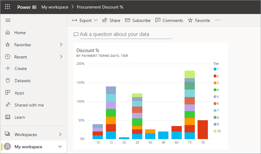
A Power BI dashboard visualizes data that provides a consolidated view of key metrics, trends, and insights in a single, interactive interface. It serves as a central hub for monitoring and analyzing data from various sources, allowing users to quickly grasp a business’s overall performance and status or specific areas of interest.
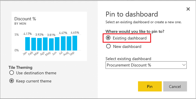
Power BI dashboards are created using Power BI Desktop or the Power BI service, which are part of the Microsoft Power BI suite. These dashboards can be built from various data sources, including databases, spreadsheets, cloud services, and online platforms.
Power BI provides powerful data modeling and visualization capabilities to transform raw data into meaningful visual representations.
Benefits of creating and using Power BI dashboards
Power BI dashboards offer several benefits that empower organizations to make data-driven decisions and gain valuable insights. Here are some of the key advantages:
- Visual representation: Power BI dashboards provide a visually appealing and intuitive data presentation. Visualizations such as charts, graphs, and maps make it easier to understand complex information and identify patterns or trends briefly.
- Centralized view: Dashboards consolidate data from multiple sources into one view, allowing users to monitor key metrics and performance indicators in one place. This centralized view saves time and effort compared to manually analyzing data from different sources.
- Real-time monitoring: Power BI supports real-time data streaming, enabling organizations to monitor their data and metrics in real-time. This feature allows quick identification of changes or anomalies, empowering timely decision-making and proactive action.
- Interactive exploration: Users can interact with Power BI dashboards by applying filters, drill-through actions, and other interactive features. This interactivity allows for deeper data exploration and analysis, helping users uncover insights and answer specific business questions.
- Cross-platform accessibility: Power BI dashboards can be accessed across various devices and platforms, including desktop computers, web browsers, and mobile devices. This flexibility lets users stay connected and informed about their data from anywhere, enhancing productivity and collaboration.